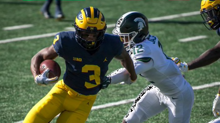
Ranking all Big Ten football uniforms from worst to first
By Austin Lloyd

11. Illinois Fighting Illini
The Illini used to have it going on with the typing of the state name on the helmets. But since that era, they have relied too heavily on the boring “I” logo (if you can even call it a logo). Not to mention that the number formatting is a tad lame without an outline. It’s a shame, too, as the color balance is pretty superb.
10. Ohio State Buckeyes
Such an iconic uniform design for Ohio State, but just a tad too generic in the process. A silver helmet, and white block numbers with no outline. A program of Ohio State’s standards should do better than that lackluster showing in the fashion department.
9. Michigan Wolverines
Finally, something Michigan can beat the Buckeyes at: uniform attractiveness. The Wolverines have a neat uniform with a nice color balance, but the look just merely isn’t one that I care too much for. The helmet design is unique, but it’s not as impactful as Alabama’s numbers, or Notre Dame’s shiny gold. Michigan looks cool, but that’s all.