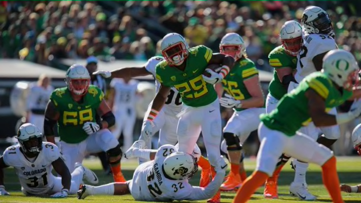
10. 2000-2002 uniforms
Back in 2000 the Ducks were really beginning to rise to prominence. They also still wore uniforms for an entire season at that point. And those uniforms were relatively simple affairs, as the designers stuck to the school colors for the most part while adding a modest bit of flair. These seasons are notable for featuring the first editions of the modernized “O” logo that features the outlines of former and current football stadiums Hayward Field and Autzen Stadium.
The turn-of-the-century look is classic in both home and road editions, serving as a bridge between the looks of yesteryear and the modernized versions of the present. The home versions were heavy on black, using the green and yellow school colors as an accent. The road uniforms did the same on a white background. In both cases there were stripes up the sides of both legs leading up into the jersey, a sleek and integrated look that is easily identifiable with the Joey Harrington-led teams that went 21-3 over the 2000 and 2001 seasons.
