10 of 11

2. TCU Horned Frogs
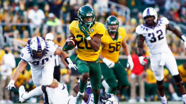
Essentially, the uniform design of Texas Christian is like Kansas State’s but on steroids. It looks much sharper, exciting and is definitely more modern.
The logo is awesome and the idea of purple and white with a black trim is visually well-executed. I originally took issue with the color of the numbers, but upon further inspection, it matches that of the horned frog in the logo, so I can’t even complain about that.
The sole standout blemish is the number formatting. The font isn’t bad, but the unnecessary slashes through the digits themselves are somewhat dumb. But such a minute detail was not enough to remove TCU from their No. 2 ranking.
There is only one squad that dresses up better in the entire Big 12 Conference. But which one?
