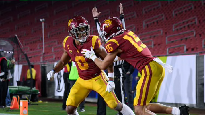
6. UCLA Bruins
The Bruins have a dynamic pair of colors that is almost never seen on other CFB uniforms, at least at the Power 5 level. There is not much negativity to spout off about their fits, rather they are just not as flattering as the ones ranked higher. My sole complaint would be how UCLA sometimes slaps a gold facemask on a helmet with a base of the same color. It results in an abundance of gold on the head for me in those cases.
5. Washington Huskies
A splendid color scheme that is very well-executed and better than UCLA’s is what has the Huskies ranked so high on this list. Their font used to be stupid, but they have since vastly improved it. The one tally mark against Washington personally is their ungodly “W” logo. The asymmetry is just downright hideous and the fact that the university finds it acceptable sickens me deeply. Give that letter a chiropractic adjustment and we have a uniform that is just about perfect.
4. Colorado Buffaloes
The complete opposite of Washington is Colorado, and that is due to their helmet being a leading cause in what makes their fits so solid. The gold and black color duo is so satisfying on the eyes, especially when they are balanced appropriately. What tops it off is the charging buffalo, which gives off the intimidating vibe that football teams should strive for. Virtually CU’s only flaw is their pants. They are not white to match the numbers, yet not gold to match the helmet, either. Drop the beige outline and pants, match the pants to the helmet’s shade of gold and leave white block numbers on the jerseys, and then the Buffs are in business.
