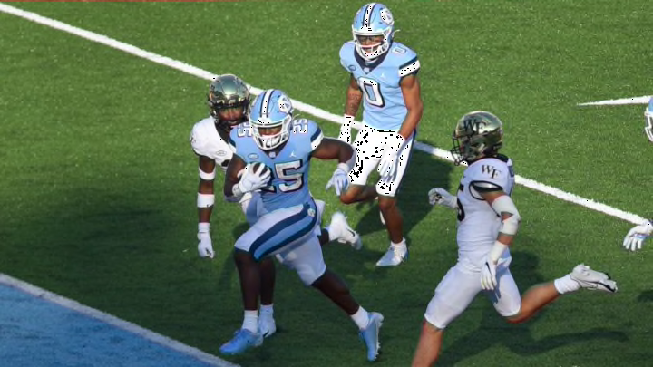
ACC Football: Ranking every uniform from worst to first
By Austin Lloyd

#9: Wake Forest Demon Deacons
This placement punctures my soul, as the Deacs are my favorite college team. However, I cannot afford to let subjectivity cloud my criticizing of their uniforms.
Pictured above is what I would call the “typical home uniform” for Wake Forest. It’s a menacing style, with a color combo that is nearly impossible to go wrong with. But there are some hiccups in these fits nonetheless, such as the Times New Roman “WF” on both the helmets and sleeves, which feels rather redundant. Not to mention that all of the teams ranked higher just have superiors appearances. Sorry Deacon Nation, but I have to keep this inspection strictly unbiased.
#8: North Carolina State Wolfpack
Sticking with the North Carolina theme, we have NC State. If I have said it once I have said it a million times: you can never go wrong with a red and black color scheme, and the Wolfpack are living proof of that. The recent prioritization of the retro wolf logo was another amazing choice made by the program. The ridiculous design on their shoulders, however, is a different story.
#7: Pittsburgh Panthers
The return to the classic and well-balanced duo of the vibrant blue and yellow is what knocked Pitt up to such a tier. The brightness is so satisfying, while not putting a strain on the eyes. What really hurts the Panthers, though, is their ungodly font. It is just too difficult to ignore when typically round numbers have cone-shaped tips; just plain unnatural.