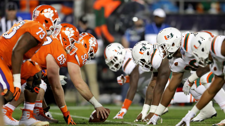
#3: Miami Hurricanes
The iconic quality of the Miami “U” logo (along with its unique coloring) is 99% of why it is ranked so high. Beyond those two things, the fact that the logo is a “U” in the first place makes no sense to me. Even their alternate emblem depicting the rowdy ibis is strange since they are the, you know, Hurricanes?
#2: Notre Dame Fighting Irish
Similar to Miami, this is a logo judged almost exclusively in terms of its notoriety. Notre Dame is one of the most hardcore programs in the history of college football.
Unfortunately, their primary logo used to depict such elite standards of performance is nothing more than an overlapping “N” and “D,” the former of which is too skinny and the latter of which is too fat. But at the end of the day, everybody who is anybody knows that logo when they see it. Only one image in the entire Atlantic Coast Conference is greater. But which one?
