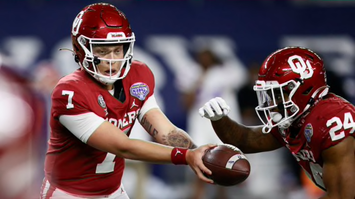
From the iconic simplicity of Oklahoma’s interlocking “OU” to Kansas’ vibrantly creative Jayhawk (whatever that is), Big 12 football has a wide array of logos to choose from when breaking down what makes their conference one of the most attractive.
I usually critique a school’s primary logo, based on its combination of both symbolism and originality. For example, the aforementioned Sooners logo is indicative of some of the most elite in college football history, while just being two measly letters.
Meanwhile, Kansas has a happy little bird that resembles the logos of no other programs in America. Its downside is that the absolute last thing they convey is the word “intimidating”.
Even though these sorts of issues may be a common trend when listing the Big 12 designs, it needs to be noted that such a dilemma would be apparent regardless of which conference was having its logos ranked.
With that established, there is no reason that we cannot get this show on the road.
Here are the complete rankings of every primary logo that the Big 12 has to offer, listed from worst to first. And for those who have not seen my emblem rankings for the ACC, just know that “primary” means the main logo that the university flaunts. So if an alternate/throwback insignia looks better than the primary one for your team, too bad.
