10. Baylor Bears
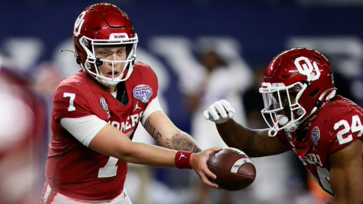
Baylor has a color scheme that is far from the worst in the conference, and the font of the letters could certainly be worse. However, it lies pretty far on the simplistic and unoriginal sides of the spectrum. This flaw, though, is survivable due to how commonplace of an error it is amongst schools nationwide. What actually makes the Bears’ design so unforgivable is that its formatting is the exact same as Oklahoma’s, but without the historical dominance backing it up. Sorry Baylor, it just wasn’t enough.
9. Oklahoma State Cowboys
The “OSU” logo has a multitude of hiccups in its design, such as the awkward lines that jut out of the large “S” in the middle, the letters being slanted (which typically symbolizes speed, despite the fact that cowboys are not known for their speed), and the reflective orange shading that resembles a style normally seen on a Hot Wheels car. That’s just gross.
8. West Virginia Mountaineers
Not much to talk about with this one; it’s a “W” placed on top of a “V” while donning a strange font. The entire concept of relying on letters for logos is not original, but at least the font is. The color scheme is also appealing.
