Ranking all Big 12 football team logos from worst to first

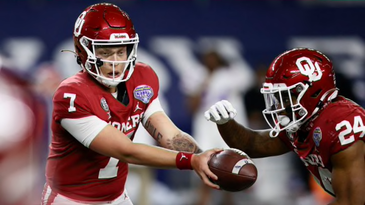
ARLINGTON, TEXAS - DECEMBER 30: Quarterback Spencer Rattler #7 hands off to running back Marcus Major #24 of the Oklahoma Sooners against the Florida Gators during the second half at AT&T Stadium on December 30, 2020 in Arlington, Texas. (Photo by Tom Pennington/Getty Images)
ARLINGTON, TEXAS - DECEMBER 30: Quarterback Spencer Rattler #7 hands off to running back Marcus Major #24 of the Oklahoma Sooners against the Florida Gators during the second half at AT&T Stadium on December 30, 2020 in Arlington, Texas. (Photo by Tom Pennington/Getty Images) /
facebooktwitterreddit
Prev
3 of 5
Next
LUBBOCK, TEXAS – OCTOBER 24: Helmets sit along the sideline before the college football game between the Texas Tech Red Raiders and the West Virginia Mountaineers on October 24, 2020 at Jones AT&T Stadium in Lubbock, Texas. (Photo by John E. Moore III/Getty Images)
LUBBOCK, TEXAS – OCTOBER 24: Helmets sit along the sideline before the college football game between the Texas Tech Red Raiders and the West Virginia Mountaineers on October 24, 2020 at Jones AT&T Stadium in Lubbock, Texas. (Photo by John E. Moore III/Getty Images) /

7. Texas Tech Red Raiders

I am not familiar with the style of one letter being place in front of another like this, so there does need to be some points awarded for originality. Also, red and black is an extremely flattering duo that is executed very nicely on the look photographed above.

6. Iowa State Cyclones

Neat color combo with the red and yellow, but the logo is nothing more than the letter “I” with “STATE” stamped in front of it. And being one of the worst major FBS programs of all time fails to help a team out too much in the notoriety department. Not a bad style for the Cyclones, but it certainly isn’t turning any heads.

5. Oklahoma Sooners

Their greatness got them this far, but not far enough. The Sooners’ problem is as clear as day, and that is the boringness that their logo has emanated to anyone who could see, most namely due to both their display of only one color and the dreadfully cliché decision to go with two letters and nothing more.