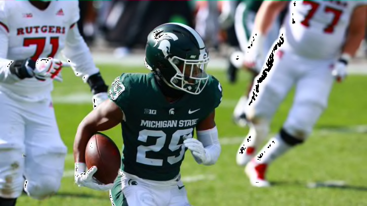
The Big Ten Conference has some logos that are as stylish as their teams are competitive.
From the iconic simplicity of Michigan’s “M” to the equally-renowned depiction of a mountain lion (A.K.A a “Nittany” lion) by Penn State, the Big Ten has some rather dapper logos displayed for admiration and, quite frankly, intimidation.
Unfortunately, the bulk of the conference’s members do appear to rely on the letter-based design, which is exactly what it is called: a design centered around a flipping letter and nothing more. And to my surprise, some programs cannot even manage to pull that off adequately.
Every college league has its fair share of universities who commit such a crime, however; I have learned this lesson the hard way when ranking all fourteen logos of the Atlantic Coast Conference. And believe me, ranking letter-based logos amongst themselves is as entertaining as watching grass grow.
With that acknowledged, we will just be focusing on the most elite emblems of a league this time around. Here are the top five logos of the Big Ten Conference.
#5: Maryland Terrapins
Their primary insignia consists of an “M” with a thin banner underneath it that displays the design of the ungodly Maryland state flag. But luckily for the Terrapins, that is apparently all it takes to outshine ten fellow Big Ten schools in the presentation department.
For what it’s worth if the turtle was their primary logo they would most likely be ranked even higher than fifth.
