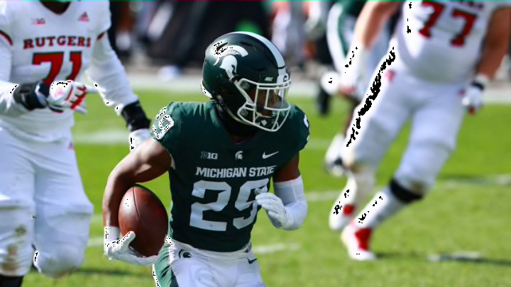
#2: Michigan State Spartans
The MSU spartan logo is original (San Jose State’s spartan design is noticeably different), the idea of a spartan is successful in inducing fear, and the school makes it look good on a helmet. The sole downside is that it is very limiting, most namely due to its completely white coloring and silhouette-like illustration.
Add some detail to the current style, and it would for sure be at the top of this list.
#1: Iowa Hawkeyes
The Iowa Hawkeyes logo is the epitome of the word “creative.” The illustration is clearly a hawk, whose eye is simultaneously the dot of an “i” for “Iowa.” Not only is that cool, but their team’s mascot is the “Hawkeyes,” which means that their emblem is perfectly showcasing it; and while that accomplishment may sound minute, many schools fail to do so with their own respective logos (which is just another reason to despise the idea of going down the letter-based route).
Long story short, Iowa’s insignia is awesome. It is also a rare example of how a single letter’s inclusion within a logo design can be a good thing.
