The logos of the Southeastern Conference are astonishingly more creative than those of some other Power 5 leagues.
I have often been critical of college football teams and their tendencies to flaunt such basic, lackluster logos, such as ones that have nothing more than a single letter in a boring font. However, the SEC is different; most of their programs have designs that are both original and detailed.
But while the conference may be better off in the emblem department than some of its counterparts from head to toe, that does not change the choices that some SEC schools made when spawning an insignia that left a good deal to be desired.
With that in mind, I will only be listing the top five logos in the Southeastern Conference, as I did with my last emblem rankings, which pertained to the Big Ten. Let’s get started by getting the 5th-place team on this list out of the way.
#5: Vanderbilt Commodores
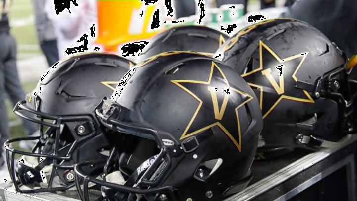
Vandy’s football program is absolutely abysmal, but at least their logo is okay. A blandly-printed “V” is what the Commodores decided to center than design around, and they figured that they would spice it up some by placing the letter in a star. Surprisingly, this works much better than one would most likely think.
What really kicks things up a notch for Vanderbilt, though, is the significance of the logo’s symbolism. Their colors are black and gold, which resembles the scheme of the former Commodore ranking in the United States Military. And what shape is often seen on it? A star. There is a ton of meaning shoved into Vandy’s emblem, and that drives it into fifth place for me.
