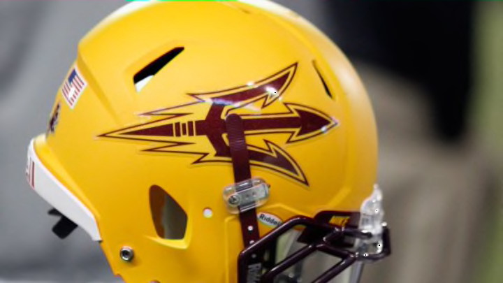
There are some Pac-12 logos out there that put their respective teams’ performances to shame.
Let’s not beat around the bush: relatively speaking, the Pac-12 Conference is just not one to root for in the world of collegiate football. All hope is not lost, though, because while they may suck at the game, they can look pretty dapper while playing it if they have represented the right logos on their uniforms.
Now just like with the teams in any other Power-5 conference, some logos are just straight-up garbage and nothing more. For example, Oregon has an “O,” and that’s it. For a program that is most likely the best in their league right now, along with having obtained an undeserved reputation for looking trendy and fashionable, that is downright pathetic.
Speaking of schools thinking that nothing more than a letter or two suffices for a creative logo design, several members of the Pac-12 are guilty of such a crime. As a result, I will do what I have done with other conference logo rankings of mine and keep the upcoming list to only five universities. Let’s get started.
#5: Oregon State Beavers
Black and orange is a difficult color scheme to ruin, and Oregon State did no such thing. The agitated beaver emblem is both original and successful in, at the very least, illustrating the amount of intimidation that the Oregon State football team has been known to give off in recent memory.
Unfortunately, the design kind of favors the appearance of a guinea pig, which is a little less awesome. However, that is still quite scary when compared to the aforementioned football program that it is supposed to represent. Alright, enough lame jokes; it’s time for the 4th-ranked logo.
