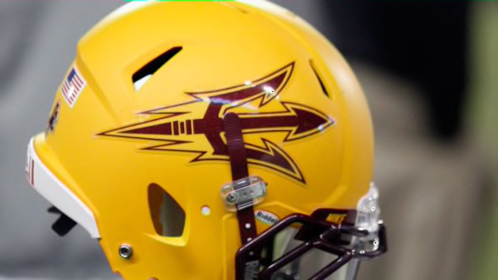
#4: Arizona State Sun Devils
Arizona State does virtually everything right with their primary emblem, the sun devil’s pitchfork, as it gives off similar vibes to the Florida State spear whenever it is slapped onto the sides of an ASU helmet. And believe me, that is a compliment.
The dynamic color duo of dark red and gold accurately depict the imagery that would correlate with a sun devil, and the concept is obviously one that Arizona State has not ripped off of any other mainstream school. Outstanding execution by ASU.
#3: Washington State Cougars
The Cougars have a logo design that many folks in the college football community seem to despise, and I have never quite understood why. Sure, the layout does not exactly display what we would normally see as a “cougar.”
However, I feel that the heavy dose of creativity infused into it does more than enough to make up for that. The letters in “WSU” are mushed together just enough to portray a roaring cougar, but not too much to where said letters are difficult to make out.
To keep it brief, Washington State gets just about all of its points from the clever idea instead of the finished product.
