Army
Best: 1977-1978, 1983-2007, 2009-2011
The classic Army look. A light gold helmet, a black stripe, and a black facemask. It’s an iconic look for the Black Knights that they use a variation of today. One of the few helmets in college football that should never change.
Worst: H, December 12, 2015
It’s impossible to criticize these. I absolutely love what they stand for (each of the 17 branches of the Army are represented) and it’s a good idea and cool look. But I have to pick one, and this is it. The reason? Numbers on one side, logos on the other, and 17 different logos to boot.
BYU
Best: C, 1978-1997, 2009, 2013-2014
Classic BYU. It’s pretty much what they wore when they were at their peak as a program. The bright blue looks great n white, much better than the darker shade the Cougars have used recently. A variation of this look was brought back in 2019.
Worst: October 28, 1989
The classic BYU look, but with a red dot instead of the traditional Y. Nobody really has a concrete answer why they did this, with reasons ranging from Hurricane relief support to a food drive to red ribbon week. Either way, this was a one-off, thankfully.
Connecticut
Best: J, 2018-present
Michigan like Northern Illinois, I’m a sucker for the husky. This one is full facing forward, blue and white, and outlined in red to make it pop. It would probably look better with a blue facemask, but it still does the job. If UConn played as well as they looked they might not be one of college football’s laughing stocks.
Worst: 1965
Is it a C? Or is it a football? It could plausibly be both, which makes the logo creative, just not good. Whatever it is is outlined in blue, with the inside white except the center has a blue oval in it.
Liberty
Best: B, 2013
Pre-FBS days for the Flames. A rare red on red that works, mostly because the red LU logo is outlined in both white and blue. The entire helmet is red, including the facemask. It might be red overload for some, but I like it.
Worst: 1994-1999
Nothing that bad, but it’s a plain red helmet with no logos. Liberty has had some great logos on their helmet, so to see an empty helmet is a shame.
UMass
Best: A, 2012-2013
UMass hasn’t had any helmets that stick out as great, but this one is probably the best. It’s the standard UMass logo on a black shell. Not really exciting.
Worst: G, 2017-present
On the flip side, UMass hasn’t had anything that’s that bad either. This one gets the vote for the awkward UM on the helmet. It strangely looks like a Michigan logo with a Utah U over the top of it.
New Mexico State
Best: C3, 2016-present
This seems hypocritical because this has a logo on one side and numbers on the other. While I don’t like that aspect of it, I love the crossing pistols the Aggies use on the right side.
Worst: 2009-2012
Not terrible, but not good either. The logo is “NM” on top and “State” in smaller letters on the bottom. It’s a significant downgrade from what the Aggies wore in the 90s.
Notre Dame
Best: 1964-present
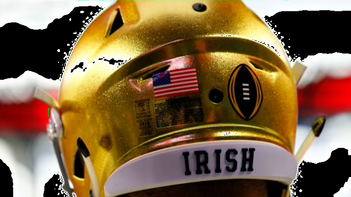
Classic. Iconic. Clean. When someone asks you about football helmets in general, this one is up there with the Dallas Cowboys as one of the ones that’ll be brought up first. Truly one of the greatest and most legendary helmets in any sport.
Worst: November 17, 2018
Let me be blunt here: A solid majority of the Shamrock Series helmets are absolute trash. Why is this the worst offender? It’s not even gold. It’s navy blue with the interlocking ND in a circle with pinstripes. Absolutely awful.
