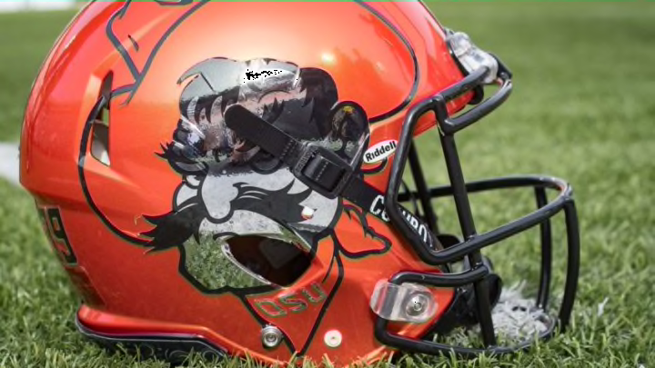
Oklahoma State
Best: K, 2014-present
I know most of the votes would probably go to the Barry Sanders era look, but Pistol Pete on the helmet looks fantastic. It’s a really intimidating (and slightly creepy) mascot, so to make your opponents look at it the entire game is pretty sweet.
Worst: M, 2015
It’s not a bad helmet, but it’s incredibly plain. The “OSU” look on the side gives no indication whether it’s Oklahoma State, Oregon State, or Ohio State. Not a fan.
Texas
Best: 1977-present
Another Big 12 football team that has stayed consistent in its look, this is THE Texas look. There’s not much to say other than it being in the upper echelon of legendary college football helmets.
Worst: 1961-1962
Again, not much to choose from. But the numbers of the logo make the helmet look too busy. And an orange stripe down the center would normally be nice, but it’s not Texas.
TCU
Best: Q, 2016-present
A shiny black shell with a chrome purple decal of the TCU frog and chrome purple facemask. What a look. It’s a special helmet that, unlike many others, shouldn’t be worn all the time, but for big games, this should be the first helmet they go to.
Worst: 1967
I’m assuming TCU is going for the Texas A&M look, but this definitely doesn’t work. The helmet reads as “CTU” and in purple and white. Great color scheme, but disorganized letters hurt it a lot.
Texas Tech
Best: N, 2016-present
Look, I know I’m being extremely hypocritical with the color on the color thing, in this case, red on red. But the logo is easy to see on these, and honestly tell me these aren’t just gorgeous.
Worst: J, 2014
The helmet is half one color, half another. It makes the logo look extremely off-center, which in this case is the normal Tech logo inside an outline of Texas. Cool concept, but it would have been miles better on just one color.
West Virginia
Best: A, 1980-present
This look has been around for 41 years now, but it’s not in the same tier as the elite college football helmets. It’s another case of plain and simple equalling success.
Worst: 1965
West Virginia used more of a gold than yellow look at this point which is pretty nice. The current blue and yellow appear in the logo, but a state outline of West Virginia appears in powder blue for some reason. It’s extremely out of place, and later designs of the same helmet show how bad that one is.
