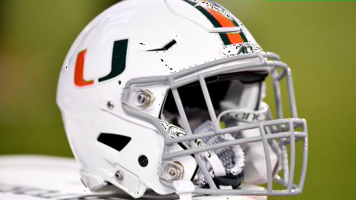
Florida State
Best: 1976-2013
Florida State, for the most part, uses that same design today. But the coloring and size of the logo make the older version get the pick. The old style features a bigger logo with a darker shade of gold on the shell and darker maroon on the facemask.
Worst: 1964
The same gold shell, but instead of a logo, it simply says “State”. No design, the letters aren’t curved, just “State” in a straight line on the helmet.
Georgia Tech
Best: Late 1970s through 2007
This one is slightly darker than the current version. Georgia Tech has worn different variations since the 1960s. The blue face mask is an upgrade from the white mask in previous versions.
Worst: B, 2012, 2014-2017
Of course, a team named the Yellow Jackets associate with bees. And bees make honey. So naturally, let’s make a helmet that looks like honeycomb. Man, these are just bad. It’s another thing that sounds decent in execution but should have ended right there.
Louisville
Best: A, 2014-present
The photo on The Helmet Project doesn’t do this helmet justice. The helmet is black, and when the outside light shines on the chrome logo, it looks outstanding. Probably one of the best designs in any football league around the world.
Worst: D, 2015-present
I almost hate to pick this one. The problem is the logo, which honestly is a great one. The problem is it looks like something out of an art museum that’s just thrown on the side of a helmet. The logo is actually too nice.
