Miami
Best: F, 2017-present
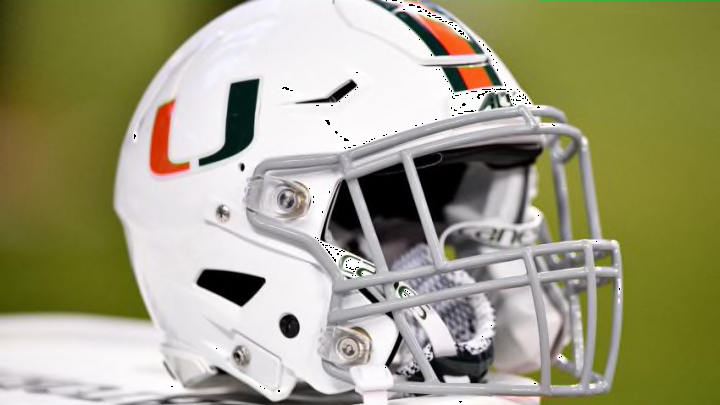
I know, it’s not the iconic Miami helmet we all know and love. But check out this Miami Nights look. The logo looks fantastic on an all-black helmet. It’s another one that’s only worn on special occasions.
Worst: D, 2015
Again, white on white. You can barely see the logo. There’s no stripe, no orange, and no green. All white. Just shouldn’t happen.
North Carolina
Best: O, 2016-present
The North Carolina blue on black just looks unbelievable. It’s better than the blue on white version by a mile, although those are nice as well. It kind of reminds me of the Heels’ basketball jerseys.
Worst: P, 2019-present
Why why why would anyone ever put a foot on a helmet? And why would anyone green light that look coming back from the dead? Seriously, it’s a blue human foot cartoon on a helmet. Unlike its predecessors, this helmet isn’t even chrome. It just goes to show you really can’t polish a — you know.
NC State
Best: U, 2020-present
Another great red and black combo. This slightly differs from O (2017-present) in that the logo is much larger. The wolf logo is an intimidating one, not one that makes you laugh like the other North Carolina school.
Worst: 1963
Nothing offensive, another victim of too plain compared to the rest of the Wolfpack’s options. Plus, the red S looks more like an oversized 5.
