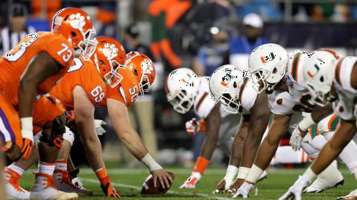
ACC football teams have some sinister logos in their arsenal, while some others are not so much.
In college football, seemingly more than any other sport, logos are a hit-or-miss genre. And unfortunately, the ACC takes part in both hitting and missing.
Some CFB programs have a dominant emblem, an insignia that is supposed to symbolize defeat or the loss of hope. Meanwhile, some others merely rely on a letter or two to send their message. Only the greatest of schools can strike fear into the hearts of their enemies while practicing the latter method, such as powerhouses like Notre Dame, USC, and Oklahoma.
With that said, we are going to take a look at all fifteen logos (Fighting Irish included) that ACC football teams have to offer. In the process, teams will be ranked in regards to their originality, creativity, iconic factor, and ultimately, overall appearance.
Does Clemson look as tough as they play? Does Florida State give off vibes that they are not intimidating enough to back up? Let’s find out. Here is the complete list of every ACC football logo ranked from worst to first.
Note that most teams have a variety of emblems and, as a result, will be judged based solely on the primary version that they display.
