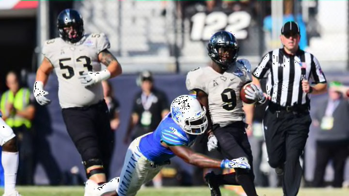
AAC Football: Ranking the best uniforms in the conference

Temple presents problems both technical (the school colors are cherry and white, yet cherries are just blatantly not that color) and aesthetic (those checkerboard pants… eh). The shoulder logo is awkward. It all looks like one giant Microsoft loading screen from the mid-2000s.
I’ll give Temple enough credit to avoid the cellar for two reasons. First, while sporting what is undoubtedly one of the clunkier uniform designs in football, the Owls have managed to make a reasonable brand of it. When you see that off-red, checkerboard-ed blur take the field, you know it’s Temple. There’s something to be said for that, however small.
Second, the black alternate uniforms that they’ve been breaking out as of late are absolutely fire. If Temple used that as their base look, they would skyrocket towards the front end of this list. Alas, they’re sticking with the same old for the time being, and thus we are sticking the Owls in 11th.