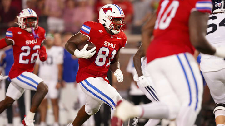
Battling.#PonyUpDallas pic.twitter.com/XXIJMvnxEs
— SMU Football (@SMUFB) September 7, 2024
SMU appeared on last week's list of the best uniforms. They should always be considered for these lists since they have a great classic look with their traditional blue and red color scheme. It's just a perfect mix.
Now, in their Friday night matchup against BYU, the Mustangs sported sleek-looking red alternate jerseys. This is not the first time that the school has worn red jerseys, but these are likely the sharpest-looking ones they've had.
Tonight’s look for @BYUfootball #uniswag pic.twitter.com/RFWAwMQw1D
— UNISWAG (@UNISWAG) September 6, 2024
Speaking of SMU, how about their opponent's uniform? BYU also sported a sweet look on Friday night. They wore dark navy helmets with white decals and a white facemask. This on top of the white jersey is a great look, especially for an evening game. Everything stands out perfectly because of the dark and light contrasts. This is just a solid combination and it definitely deserves to be mentioned.
Black and White Combo for @NUFBFamily in Week 2 🔥🔥🔥 pic.twitter.com/m9fLAdu0oz
— College Football Uniform Watch (@CFB_UniWatch) September 4, 2024
Northwestern is another team that returns for the second week in a row. This Friday, they hosted Duke in their first primetime night game of the season. For the occasion, Northwestern wore their black alternate jerseys. The numbers have purple edging and the sleeves have a thick purple stripe. They follow it with white pants and an all-white helmet. The headgear has the school's name written across it, with a script font in purple.
Black On Black with the New Lid for @ULM_FB 🔥🔥🔥🔥 pic.twitter.com/PSKzxUOmlO
— College Football Uniform Watch (@CFB_UniWatch) September 4, 2024
Louisiana-Monroe hosted UAB this Saturday wearing these good-looking black alternates. Last week, ULM wore jerseys with their traditional maroon and gold color scheme. The jersey was primarily maroon. Those were good but these are better. The black jerseys are great, especially with the Warhawk's color scheme. Both regular colors stand out pretty well on a black background.
They wear black pants as well. However, the helmet stands out since it's white. It serves as a perfect contrast to the dark look. The helmet design is based on the iconic Curtiss P-40 Warhawk, which is a fighter-bomber plane for those who don't know. The decal looks to have a chrome, shiny pop to it, which makes it stand out even more. The choice of the maroon facemask worked great.
